

Brand Identity
Name: DeFindex (always written with capital “D” and “F”) Domain: defindex.io Sector: DeFi (Decentralized Finance) on Stellar/Soroban Value Proposition: Automated savings accounts with diversified DeFi portfolio Brand Personality: Professional, accessible, modern, trustworthy. DeFindex simplifies DeFi for everyone.Official Taglines
- “DeFi made easy.”
- “Empower your wallet.”
- “We grow together.”
- “Achieve more with automated DeFi.”
Tone of Voice
- Clear, direct, without unnecessary technical jargon
- Conveys trust and simplicity
- Inclusive: addresses both new and experienced DeFi users
- Never alarmist, never exaggerated hype
- Professional but approachable
Usage Guidelines
- Use assets exactly as provided without modifications
- Maintain safety margin around logos (at least symbol height on each side)
- Minimum logo size: 40px height (digital) / 14mm (print)
- Never rotate, distort, or change opacity
- Never apply logo on backgrounds with insufficient contrast
- For minimal applications (favicons, social avatars), use only the Symbol
DeFindex Symbol
Two intertwined arrows forming a cyclical pattern, representing automated reinvest.| Light Background | Dark Background | Monochrome |
|---|---|---|
 |  |  |
DeFindex Logo
Complete signature: Symbol + Wordmark in Familjen Grotesk Bold.Horizontal
| Light Background | Dark Background | Monochrome |
|---|---|---|
 |  |  |
Vertical
| Light Background | Dark Background | Monochrome |
|---|---|---|
 |  |  |
Logo Color Variants
Color Palette
Color Usage Rules
- White, Dark Green, and Lavender are frequently used: titles, subtitles, descriptive text
- Light Green, Light Cyan, and Coral are accent colors: highlights, boxes, buttons
- Coral is used for emphasis and keywords in italics within headlines
- Always ensure contrast and legibility
- Never use colors outside this palette
Typography
Both fonts are available on Google Fonts.
Typography Rules
- Headlines: Familjen Grotesk Bold or SemiBold
- Body text: Inter Tight Regular or Medium
- Emphasis keyword in headlines: italic + Coral color
- Maintain clear hierarchy
- Never mix more than 2 font weights in the same piece
- Fallback:
system-ui, -apple-system, "Segoe UI", sans-serif
Visual Elements
Glass Elements (3D)
Translucent 3D shapes with glassmorphism aesthetic, colored in duotone using brand palette combinations.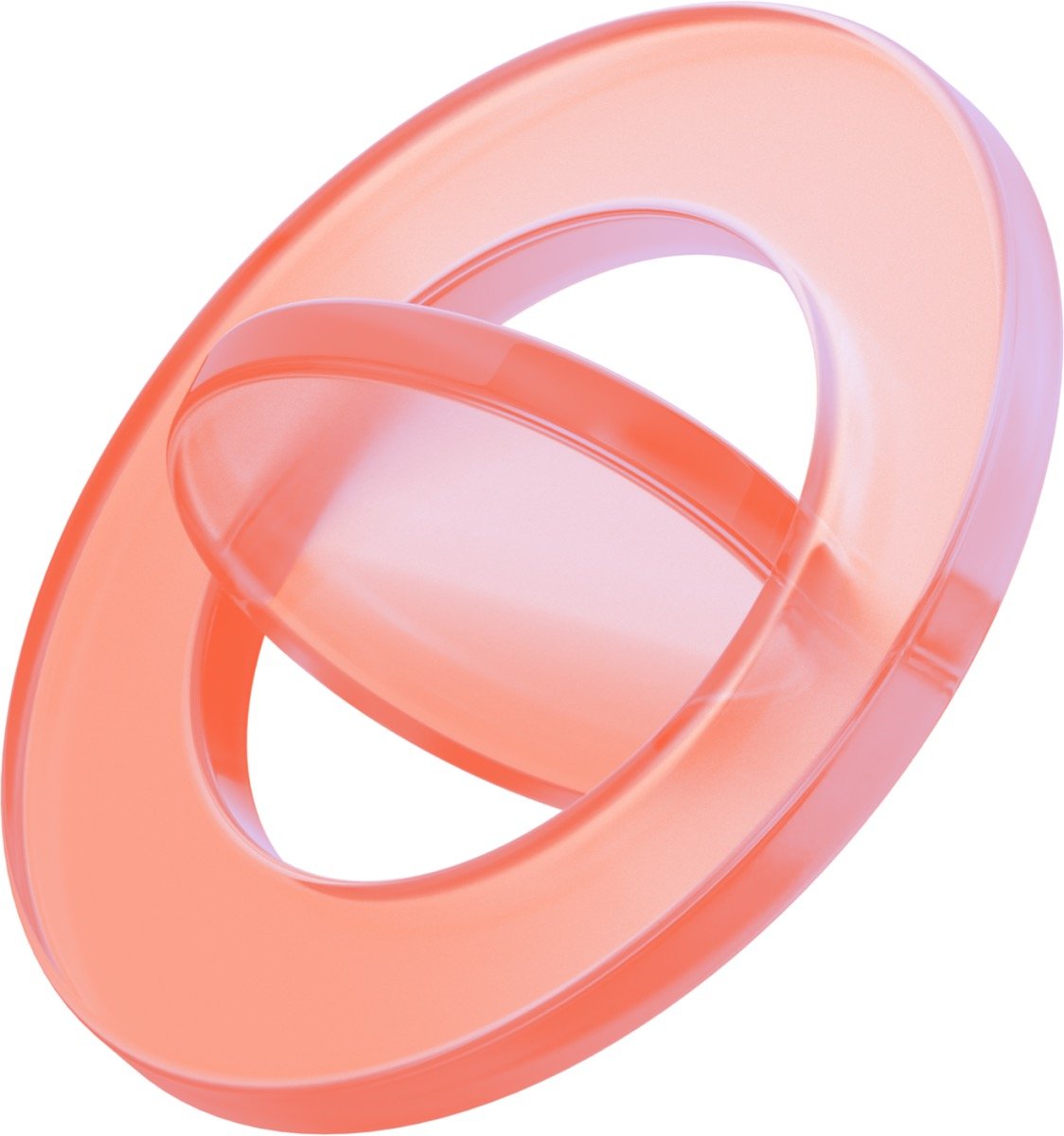 |  | 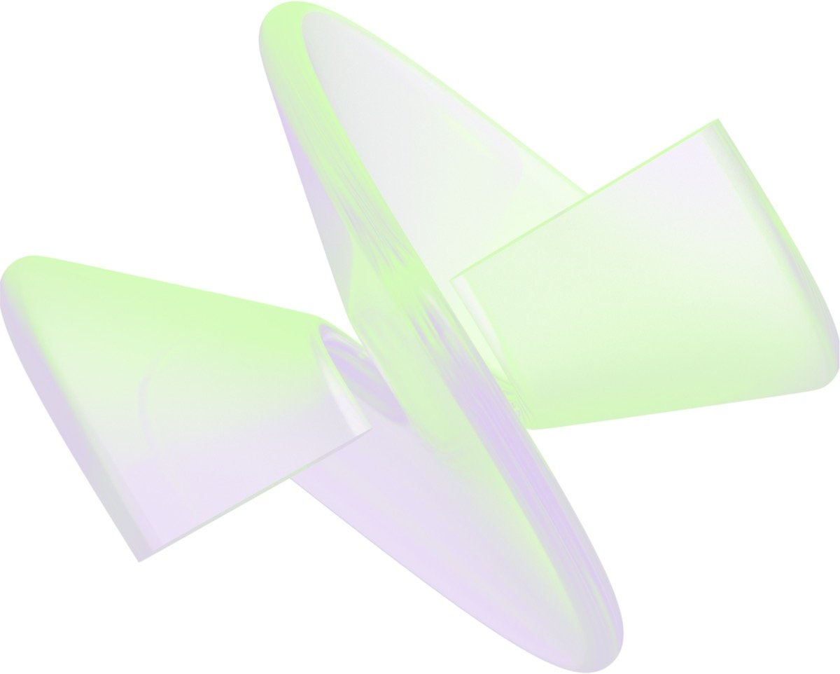 |
- Always translucent, never solid or opaque
- Types: interlocking tori/rings, crystalline shapes, fluid blobs
- Use combinations like Dark Green + Lavender, Coral + Light Cyan
Gradients
Soft, diffused gradients using brand palette colors. | 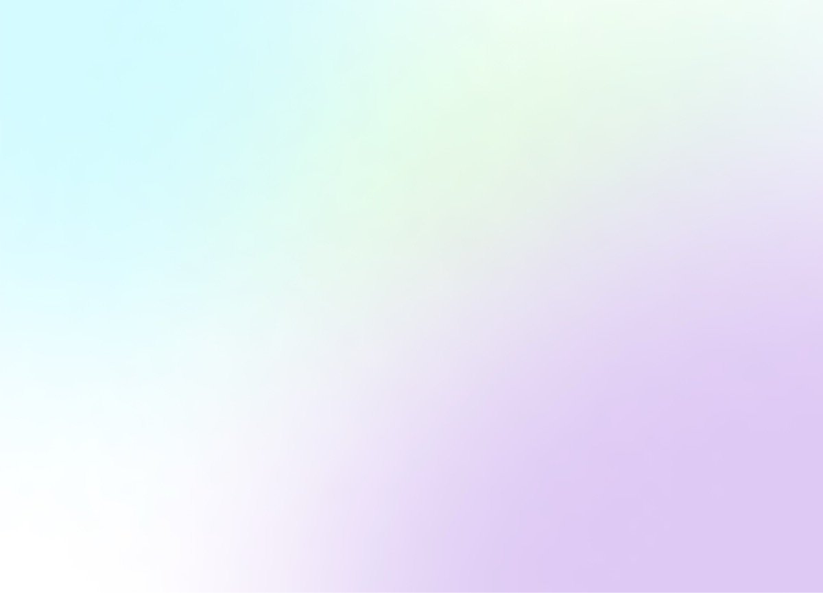 |
- Cyan → Light Green → Lavender
- Coral → Light Cyan
- Lavender → Coral
- Light Cyan → Lavender
- Light Green → Lavender → Coral
Icons
| Vault | Strategies | User | Graph | Group |
|---|---|---|---|---|
 |  |  |  |  |
Do’s and Don’ts
✅ Do
- Use generous whitespace - the brand breathes
- Prioritize clean backgrounds (white, Dark Green, or soft gradients)
- Use glass 3D elements as hero visuals
- Write “DeFindex” with capital D and F
❌ Don’t
- Use colors outside the 6-color palette
- Rotate, distort, or alter the logo
- Apply logo as watermark with reduced opacity
- Use aggressive “crypto bro” aesthetic (rockets, moons, diamonds)
- Create visually noisy or saturated compositions
- Create opaque 3D elements - always translucent glass aesthetic